 gromov
0ab4362e02
gromov
0ab4362e02
- добавлен CI для pull request и master
- настроена OIDC-публикация npm из GitHub Release
- добавлена упаковка локализованных скиллов и контрольных сумм
@gromlab/svg-sprites
🇬🇧 English | 🇷🇺 Русский


A CLI for generating SVG sprites and typed icon components for React and Next.js.
Navigation
- Features
- Support matrix
- Requirements
- Quick start
- Configuration
- Multiple sprites
- TypeScript
- Sprite formats
- Rendering methods
- Transformations
- Icon color management
- Caching
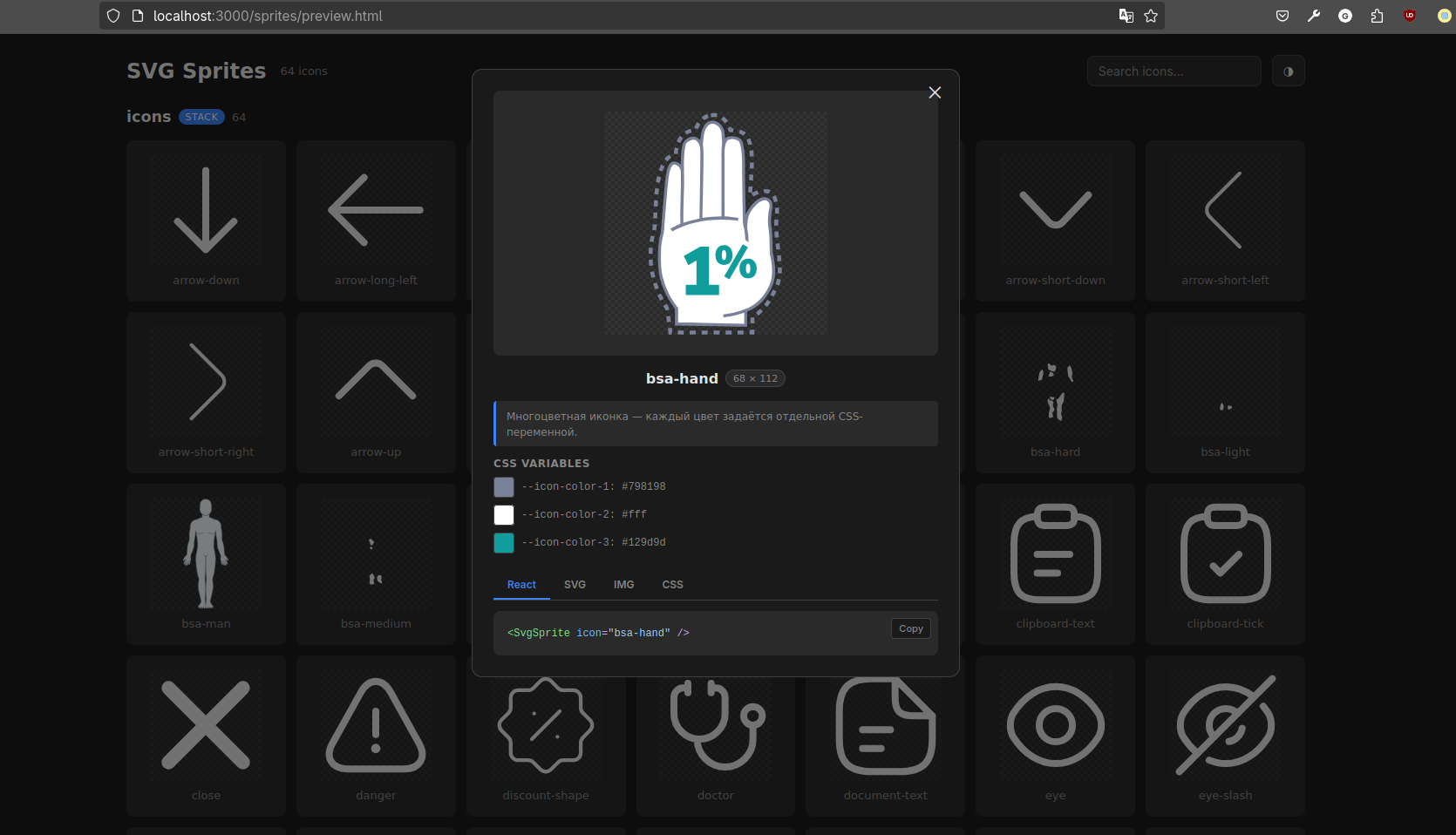
- SpriteViewer
- Migrating from 0.1.x
- Documentation
Features
- AI-agent friendly - the repository includes a ready-to-use skill with up-to-date documentation for configuring, migrating, and troubleshooting
@gromlab/svg-sprites. - TypeScript-friendly - typed React components, union types, and runtime lists of available icons.
- Clean generation - generated files are automatically excluded from Git, the sprite does not need to be placed in
publicmanually, and the generator updates only files it owns. - Shared icons without copying - SVGs from the local folder and
inputFilesare merged into a single sprite; one file can be used in multiple sprites. - Built-in interactive preview -
<SpriteViewer>is integrated as an application page and displays the provided React and Next.js sprites with search, color controls, and usage examples. - Configurable SVG transformations - remove
widthandheightwhile preservingviewBox, replace source colors with CSS variables, and add transitions forfillandstroke. - Separate cacheable SVG asset - SVG path data does not end up in JavaScript chunks, and the bundler emits a file with a content hash.
- Multiple sprites - independent React and Next.js modules with their own components, types, and SVG assets.
- Server-first Next.js - generated components work in Server Components, SSR, and SSG without the
'use client'directive. - Formats for different use cases - React and Next.js use
stack; legacy mode also supportssymbolfor existing integrations.
Support matrix
| Environment | API mode key | Status |
|---|---|---|
| React + Vite | react@vite |
Ready |
| React + Webpack 5 | react@webpack |
Ready |
| Next.js 16.2+ App Router + Turbopack | next@app/turbopack |
Ready |
| Next.js 13.4+ App Router + Webpack 5 | next@app/webpack |
Ready |
| Next.js 16.2+ Pages Router + Turbopack | next@pages/turbopack |
Ready |
| Next.js 12.2+ Pages Router + Webpack 5 | next@pages/webpack |
Ready |
| Vue | - | Coming soon |
| Standalone | - | Coming soon |
Requirements
- Node.js 18 or newer;
- the package is distributed as ESM only and is loaded via
import; - React 18 or 19 is required only for generated components and the
@gromlab/svg-sprites/reactentry point; - for subpath export typings, use TypeScript 5+ with
moduleResolution: "bundler","node16", or"nodenext".
Quick start
For a quick start, follow the guide for your stack:
Configuration
React
import { defineReactSpriteConfig } from '@gromlab/svg-sprites'

export default defineReactSpriteConfig({
  name: 'file-manager',
  description: 'File manager icons',
  inputFolder: './icons',
  inputFiles: [
    '../../shared/icons/check.svg',
  ],
  transform: {
    removeSize: true,
    replaceColors: true,
    addTransition: true,
  },
  generatedNotice: true,
})
| Option | Type | Default | Purpose |
|---|---|---|---|
name |
string |
Folder name | Name of the sprite, component, and public types |
description |
string |
None | Description for types and the debug manifest |
inputFolder |
string |
./icons |
Folder containing source SVGs, relative to the config |
inputFiles |
string[] |
[] |
Additional SVG files, relative to the config |
transform |
TransformOptions |
All enabled | Transformation settings for source SVGs |
generatedNotice |
boolean |
true |
Full or short warning in generated files |
inputFolder and inputFiles are merged into a single sprite, so one SVG file can be used in multiple sprites without copying. If the implicit ./icons folder does not exist but inputFiles is populated, generation continues using only the list. An explicitly specified missing folder is an error. Duplicate paths are deduplicated, while different files with the same icon name are treated as an error.
name is stored in kebab-case and must start with a Latin letter. The React and Next.js presets produce the stack format.
Next.js
Next.js uses the same svg-sprite.config.ts and set of options. For type checking, you can use a dedicated helper:
import { defineNextSpriteConfig } from '@gromlab/svg-sprites'

export default defineNextSpriteConfig({
  name: 'file-manager',
  description: 'File manager icons',
  inputFolder: './icons',
})
The router and bundler are selected through the mode key, so switching between Turbopack and Webpack is always explicitly reflected in the generation command.
Multiple sprites
An application can contain several independent sprites for different scopes:
Problem: one global sprite loads icons that the current screen does not need.
Solution: keep shared icons globally, and place icon sets for pages and large components in separate sprites that load alongside them.
global            -> GlobalIcon          -> shared application icons
analytics-page    -> AnalyticsPageIcon   -> icons for a specific page
file-manager      -> FileManagerIcon     -> icons for a large component
- Global sprite contains a small set of shared icons used in different parts of the application: navigation, states, and basic actions.
- Page sprite loads with a specific section and does not increase the shared sprite with icons that are not needed anywhere else.
- Large component sprite encapsulates the icon set of a complex UI module, such as a file manager or editor.
Each group gets:
- its own SVG asset;
- its own typed component;
- a separate list of icon names;
- a separate debug manifest;
- an independent cache lifecycle.
TypeScript
The main feature of the TypeScript API is icon name autocomplete directly in the icon prop:
<FileManagerIcon icon="folder" />
//                        ^ the editor suggests every icon in the sprite
SVG file names become valid icon values. A typo or unknown name immediately becomes a TypeScript error:
<FileManagerIcon icon="unknown" /> // TypeScript error
For programmatic access, the generated module exports a readonly array of all icons available in a specific sprite:
import { fileManagerIconNames } from './svg-sprite'

// readonly ['check', 'folder', ...]
You can use this list in custom catalogs, select components, tests, and other runtime scenarios. The FileManagerIconName union type is also derived from it.
File names containing spaces and other characters unsafe for SVG IDs remain part of the public TypeScript API. For the internal <symbol id>, the generator creates a stable hash ID.
folder open.svg -> icon="folder open" -> id="icon-<stable-hash>"
For such names, use the generated component or the id from the debug manifest. The manual examples below using #<name> are suitable only for names that are already safe SVG IDs.
Sprite formats
stack is the more modern format, so it is used by default. Icons can be rendered through <svg><use>, <img>, and CSS background-image.
symbol is retained for compatibility with existing integrations and supports rendering only through <svg><use>.
Rendering methods
React component - recommended
The generated component provides type safety and icon name autocomplete, and constructs the SVG asset URL itself.
<FileManagerIcon icon="check" width={24} height={24} />
Monochrome and multicolor icons are supported through color and --icon-color-N.
Manually with <svg><use>
A good low-level method that provides full control over dimensions and colors. This is exactly what the React component uses under the hood.
How you obtain spriteUrl depends on the bundler.
Vite:
import spriteUrl from './svg-sprite/generated/sprite.svg?no-inline'
Webpack 5:
const spriteUrl = new URL(
  './svg-sprite/generated/sprite.svg',
  import.meta.url,
).href
Next.js with Webpack 5 or Turbopack:
const spriteUrl = new URL(
  './svg-sprite/generated/sprite.svg',
  import.meta.url,
).href
After obtaining the URL, the icon is rendered the same way:
<svg width={24} height={24}>
  <use href={`${spriteUrl}#check`} />
</svg>
Vite, Webpack 5, and Next.js replace the source path with the final hashed asset URL automatically.
With <img> - less efficient
<img src={`${spriteUrl}#check`} width={24} height={24} alt="Done" />
The SVG loads as an isolated image: its colors cannot be changed through color or --icon-color-N.
With CSS background-image - less efficient
.icon {
  background: url('./svg-sprite/generated/sprite.svg#check') center / contain no-repeat;
}
Like <img>, this method does not allow you to control internal SVG colors. The path is specified relative to the CSS file, and Vite/Webpack replaces it with the final hashed URL during the build.
With CSS mask - less efficient
.icon {
  background-color: currentColor;
  mask: url('./svg-sprite/generated/sprite.svg#check') center / contain no-repeat;
}
A mask retains only the silhouette and colors it with a single color. The original colors, gradients, and distinctions between fill and stroke are lost.
Transformations
All transformations are enabled by default and configured independently through transform.
| Option | Default | What it does |
|---|---|---|
removeSize |
true |
Removes width and height from the root <svg> while preserving the existing viewBox. The icon size is then set externally. |
replaceColors |
true |
Replaces fill and stroke colors with --icon-color-N. For a monochrome icon, the fallback becomes currentColor; for a multicolor icon, the original colors are preserved. |
addTransition |
true |
Adds style="transition:fill 0.3s,stroke 0.3s;" directly to colored SVG elements. An existing transition is not overwritten. |
To disable a transformation, pass false for the corresponding option. For more details about the result of replaceColors, see Icon color management.
Icon color management
When color replacement is enabled, the generator analyzes fill and stroke and converts them to CSS custom properties.
Monochrome icons
If one color is found, the fallback is replaced with currentColor:
stroke="var(--icon-color-1, currentColor)"
The color is controlled by the CSS color property of the outer <svg> or its parent.
Multicolor icons
Each unique color gets a separate variable with the original fallback:
fill="var(--icon-color-1, #798198)"
fill="var(--icon-color-2, #ffffff)"
fill="var(--icon-color-3, #129d9d)"
The page can override only the required colors:
.icon {
  --icon-color-1: #4b5563;
  --icon-color-3: #14b8a6;
}
Color limitations
none,transparent,inherit,unset, andinitialare not replaced;- colors in
fill,stroke, and inlinestyleattributes are handled most reliably; - CSS classes and external stylesheets inside the source SVG are not the primary transformation use case;
- gradients, patterns, filters, and
url(#...)values require separate verification and may be incompatible with automatic color replacement; - page CSS variables are available with
<svg><use>, but are not available inside<img>andbackground-image.
Caching
The Vite, Webpack, and Next.js targets emit the sprite as a separate asset with a content hash:
/assets/sprite-<hash>.svg
This provides the following properties:
- the SVG is cached independently of JavaScript;
- changes to React code do not alter the sprite contents;
- icon changes produce a new hashed asset;
- one file is used by every instance of the generated component;
- SVG path data is absent from JavaScript chunks.
The Vite target prevents inlining through ?no-inline. The Webpack 5 target uses Asset Modules through new URL(..., import.meta.url).
SpriteViewer
SpriteViewer is a React component for viewing generated sprites inside an application's debug route.
It uses separate manifests and displays:
- sprite groups;
- the icon list and count;
- search and the system light/dark theme;
- a preview modal with the
viewBoxand color variable controls; - React, SVG, IMG, and CSS examples with code copying.
Production components do not import debug manifests. How you integrate the Viewer depends on the bundler:
- React + Vite: automatic
import.meta.glob; - React + Webpack 5: static
import(); - Next.js App Router;
- Next.js Pages Router.
The Viewer is imported from the separate @gromlab/svg-sprites/react client entry point and is not included in production icon components.
Viewer theme
By default, colorTheme="auto": the Viewer follows prefers-color-scheme and responds to system theme changes. The application theme can be passed explicitly:
<SpriteViewer sources={sources} colorTheme="dark" />
Valid colorTheme values are auto, light, and dark. When the theme is controlled externally, the built-in switch is hidden. To keep it and update the application theme through the Viewer, pass a callback:
<SpriteViewer
  sources={sources}
  colorTheme={appTheme}
  onColorThemeChange={setAppTheme}
/>
Documentation
- React + Vite
- React + Webpack 5
- Next.js App Router
- Next.js Pages Router
- Legacy mode
- Migrating from 0.1.x
- Programmatic API
License
MIT